

On Talks and Slides
Some history of style.
Once upon a time, Ed Tufte called me a “sanctimonious assohole”. I suggested that he up the dosage of his medications and stopped recommending his books to my students and colleagues1. But — The Cognitive Style of PowerPoint remains a pretty good essay (sometimes excessive) on some of its ills.
I grew up in a Kodak Slide Carousel era of presentations. Every ‘big’ talk I went to as an undergrad was formatted that way – Ektachrome 35mm slides. Usually of images — text was actually difficult to put on them, you needed a copy stand or a slide printing rig2. Now you just type words and, boom, you’re done. Add some clip art of puppies or maybe some insane typographical effects and you get the sort of talk everyone loves to hate.
At Pixar, we had a text generating system for the Image Computer. It was based on the fonts that Don Knuth had put together (Metafont) and a version of roff/nroff/troff by Tom Porter, if I’m remembering right. Here’s one from a talk I gave in London in 1989 —

Why that title? We sat around and decided to call ourselves, the animation group, “Studio Pixar” to identify as a different group than was making hardware and software. It sounds a little silly in retrospect, but hey, we weren’t in branding, just goofiness. That image rendered on the Pixar Image Computer and was then transferred to Ektachrome or 5247 using the Pixar Laser Scanner3, processed and mounted.
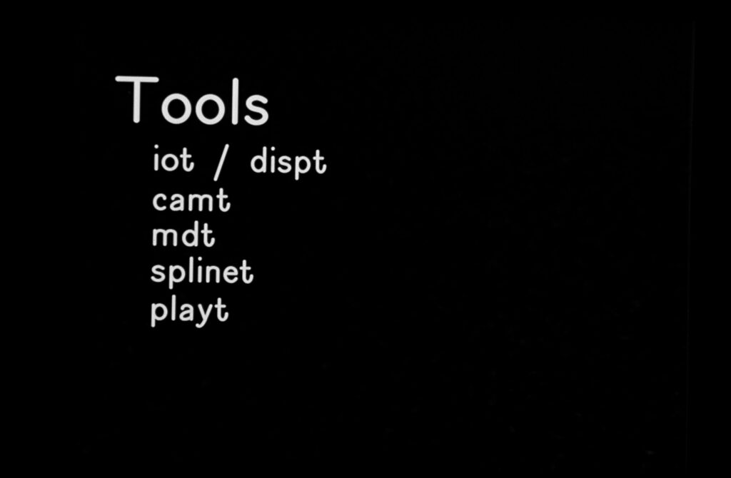
In those early days, a subset of Eben, Pete, Andrew and I used to go to places (usually colleges, usually Berkeley and Stanford) to show our films and talk about how we did things. This was all new stuff then, people wanted to know how we did it. Before one adventure, Pete decided to make some title and word slides that were more visually interesting to go with our more visually interesting content. I drew a few too, but Pete’s were the majority of the talk —

I found them a while back. I love them so much —


This was a nice vacation from these —
Anyway, someone was asking why I use so few words on my talk slides. I use a lot of (simplified) graphs and a lot of photos. I personally think it helps with the storytelling — to not have people reading lists of words, tables of numbers, &c. I loved the beamer LaTeX class back in my dissertation days — my slides were literally part of the document I created. Knuth’s Literate Programming, from which the Mathematica Notebook4 took inspiration, was also an important of my presentation upbringing. One document, code, paper and talk slides, all in one. It all comes back to Knuth somehow, which I personally think is a good thing. A very thoughtful guy who facilitated a lot of what we use today.
Finally — if you’re looking for a tool to create more thoughtful presentations, have a look at iA Presenter. Markdown driven slide presentation — like Markdown, TeX, and roff, thinking about your *content* rather than which awesome transition and bullet point animation you’re going to use. Highly recommended process.
- At a particular institution I was associated with, I put the kibosh on a plan to retain him as a consultant on visual literacy. I showed the committee the correspondence between him and me and they decided that they didn’t want such a fragile personality involved in the project. It’s the little sanctimonious revenge that warms the cockles of the heart in the wintertime. There was also possibly a bit of pot-kettle going on here I think. Regardless, I hope he’s feeling better these days. ↩︎
- Does anyone else remember the SIGGRAPH where, somehow, Larry Yeager (I think?) didn’t have his slides and made a set of hand-written bullet points, photographed them in his hotel and had them rush processed before his talk? Maybe I’m hallucinating that but I don’t think so. ↩︎
- Another interesting piece of IO hardware, built by David DiFrancisco. ↩︎
- Don’t get me started on some takes on the ‘innovation’ that are Python notebooks. I’m super happy they exist, but they’re not the new crazy thing everyone thinks. ↩︎